Data Visualisation

We show the story behind your numbers. Not just beautiful charts. Not just numbers. We create data visualisations that combine storytelling and design to help people understand what matters and why it matters.

Learn More
How data visualisation can help you

We live in a world where the flow of information never stops. Dashboards, spreadsheets, endless reports, it’s easy to get overwhelmed, and even easier to lose the thread. Data visualisation helps to turn data into clarity. Not by oversimplifying it, but by combining solid visual design with the power of storytelling. We guide your audience through the numbers — connecting dots, highlighting meaning, and showing the bigger picture behind the data. Whether you want to inform, persuade, or spark action, we help you make sense of complexity and make it easy to remember.

Key benefits of data visualisation:
  • From noise to meaning: We distill complex datasets into clear, focused visuals that highlight what truly matters.
  • Designed for people: We design with your audience in mind, making information accessible, relevant, and easy to grasp.
  • A visualisation that goes beyond pretty: Our visuals are not decoration, they’re tools for understanding, decision-making, and communication.

Gallery

How It Works

Co-creation workshop

  • A co-creation session to explore your audience, objectives and message
  • Discover the core story and challenge assumptions
  • Decide together on the key elements to visualise

Information structure & style

  • We create a clear information structure based on the co-creation
  • We propose a visual style that fits your brand and tone
  • You review and approve the direction before we move into design

Design & iterations

  • We start designing in tight, visual iterations with regular check-ins
  • You provide consolidated feedback at each step
  • We refine until everything feels just right

Testimonial

“We were positively surprised by the way and the professionalism with which the Visuality team managed to put in images a rather theoretical and complex presentation. A big thank you to the entire team!”
Catherine Naveau The SHIFT platform
Related Case Study

An inspiring dive into group participation & design at the Ocean Action! Conference

An inspiring dive into group participation & design at the Ocean Action! Conference
Client
Seas at Risk
Sector
NGO
Theme driver
Sustainability

How we created a highly-demanded communication course for scientists

How we created a highly-demanded communication course for scientists
Client
EU Joint Research Centre (JRC)
Sector
Government
Theme driver
Communication

Visuals that bring a perspective on the future of Education and Training

Visuals that bring a perspective on the future of Education and Training
Client
CMEPIUS
Sector
Public Authority
Theme driver
Innovation, Change, Communication

The Power of engaging Visuals in promoting and strengthening local youth work communities

The Power of engaging Visuals in promoting and strengthening local youth work communities
Client
EGL
Sector
NGO
Theme driver
Community, Participation

Visual storytelling on water leadership

Visual storytelling on water leadership
Client
Global Water Partnership
Sector
NGO
Theme driver
Sustainability

Book A Call With Us

Or use contact form to connect with us

Connect with us

FAQ

What’s the difference between this and a regular infographic?

Infographics often summarise ideas visually. Data visualisation starts from real data and builds the visual around that — adding story, structure, and flow. Ours do both.

Do you work with raw data or already processed numbers?

Either. We can help you make sense of raw data, or work from pre-selected insights. What matters is what you want to communicate, and who you want to reach.

What is a co-creation session, and what do we do there?

Either. We can help you make sense of raw data, or work from pre-selected insights. What matters is what you want to communicate, and who you want to reach.

What is a co-creation session, and what do we do there?

A co-creation session is a focused workshop (usually around 2 to 3 hours) where we sit down with you to explore the heart of your message together. It’s not about handing over polished slides — it’s about digging into your content, asking the right questions, and surfacing what really needs to be visualised.

During the session, we:

  • Map out the key ideas, layers, and relationships in your content
  • Challenge assumptions and spot gaps or overlaps
  • Clarify your goals, audience, and what the infographic needs to achieve
  • Start shaping a shared understanding of the story we want to tell

It’s a collaborative thinking space — creative, strategic, and often energising. Many clients say it’s the first time their complex topic has started to make real sense, even for themselves.

How many people should we bring to a co-creation session?

We recommend a small group — ideally between three and five people. More than that, and the conversation tends to get noisy or lose focus. The best mix usually includes people who hold essential information others don’t, and people who have the power to say no to the outcome. Involving both early on leads to stronger ideas and fewer roadblocks later.

Can this be interactive?

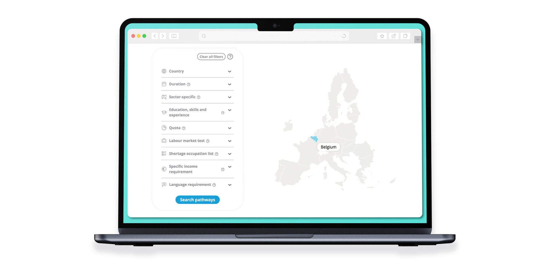
Yes! We can design interactive visuals or dashboards if your context calls for it – especially useful for reports, websites, or events where users need to explore.

What tools do you use?

We don’t rely on one tool — we choose based on what fits the story and the setting. That can range from Illustrator and Figma to custom-built visuals.

Can you help us define what insights are most important?

Absolutely. If your strategy evolves or the content needs a refresh, we can update the original visual without starting from scratch.