
We don’t just design reports. We make them work. A report is only useful if people actually read it. That’s why we go beyond layout and branding. We dive into the content, find the structure, and create a visual story that guides the reader.
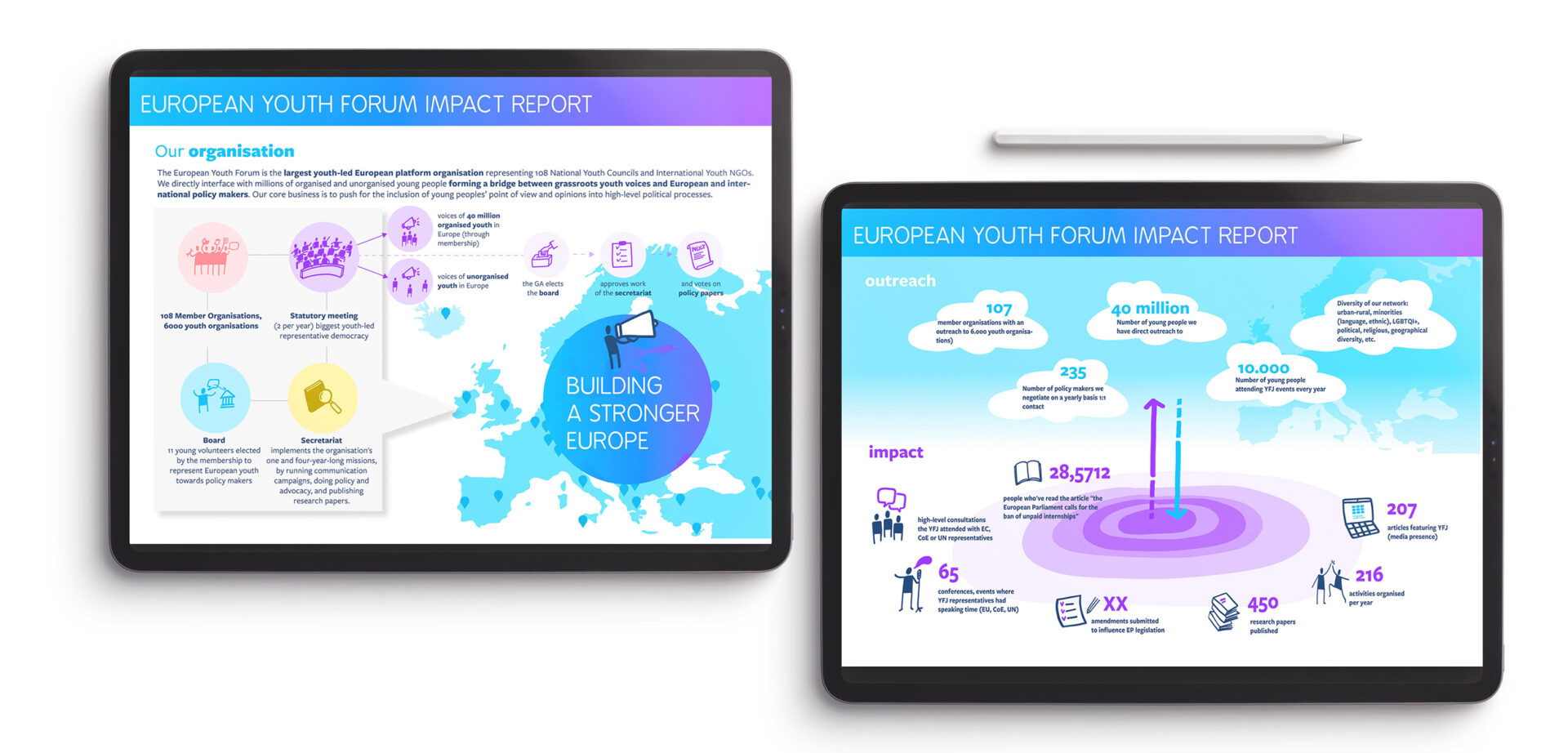
We live in a world where the flow of information never stops. Dashboards, spreadsheets, endless reports, it’s easy to get overwhelmed, and even easier to lose the thread. Data visualisation helps to turn data into clarity. Not by oversimplifying it, but by combining solid visual design with the power of storytelling. We guide your audience through the numbers — connecting dots, highlighting meaning, and showing the bigger picture behind the data. Whether you want to inform, persuade, or spark action, we help you make sense of complexity and make it easy to remember.
“Thanks to our collaboration with Visuality, the Sun Guide now has an attractive layout. Our goal was to convince citizens to start a solar project together. The layout and visuals designed by Visuality helped make the guide more accessible and appealing. The collaboration went smoothly from start to finish.“Jonathan Saelen VEA
Or use contact form to connect with us
Connect with usYes — and we can also help improve structure and flow if needed. We don’t just design around what’s there; we help to shape it into something that works better.
Usually, you provide the base content. But we can support with editing, structuring, and shaping the narrative if needed — always in close collaboration.
Usually, you provide the base content. But we can support with editing, structuring, and shaping the narrative if needed — always in close collaboration.
A co-creation session is a focused workshop (usually around 2 to 3 hours) where we sit down with you to explore the heart of your message together. It’s not about handing over polished slides — it’s about digging into your content, asking the right questions, and surfacing what really needs to be visualised.
During the session, we:
It’s a collaborative thinking space — creative, strategic, and often energising. Many clients say it’s the first time their complex topic has started to make real sense, even for themselves.
We recommend a small group — ideally between three and five people. More than that, and the conversation tends to get noisy or lose focus. The best mix usually includes people who hold essential information others don’t, and people who have the power to say no to the outcome. Involving both early on leads to stronger ideas and fewer roadblocks later.
Yes, we can. But, keep in mind that we’re not professional copy editors, we always keep an eye out for clarity, tone, and structure — and can collaborate with your team or a language expert for a final polish if needed.
Yes! We often work on multilingual documents. Just send us the different language versions, and we’ll make sure the design works seamlessly across them. We can even design parallel layouts if you want to present two languages side by side.
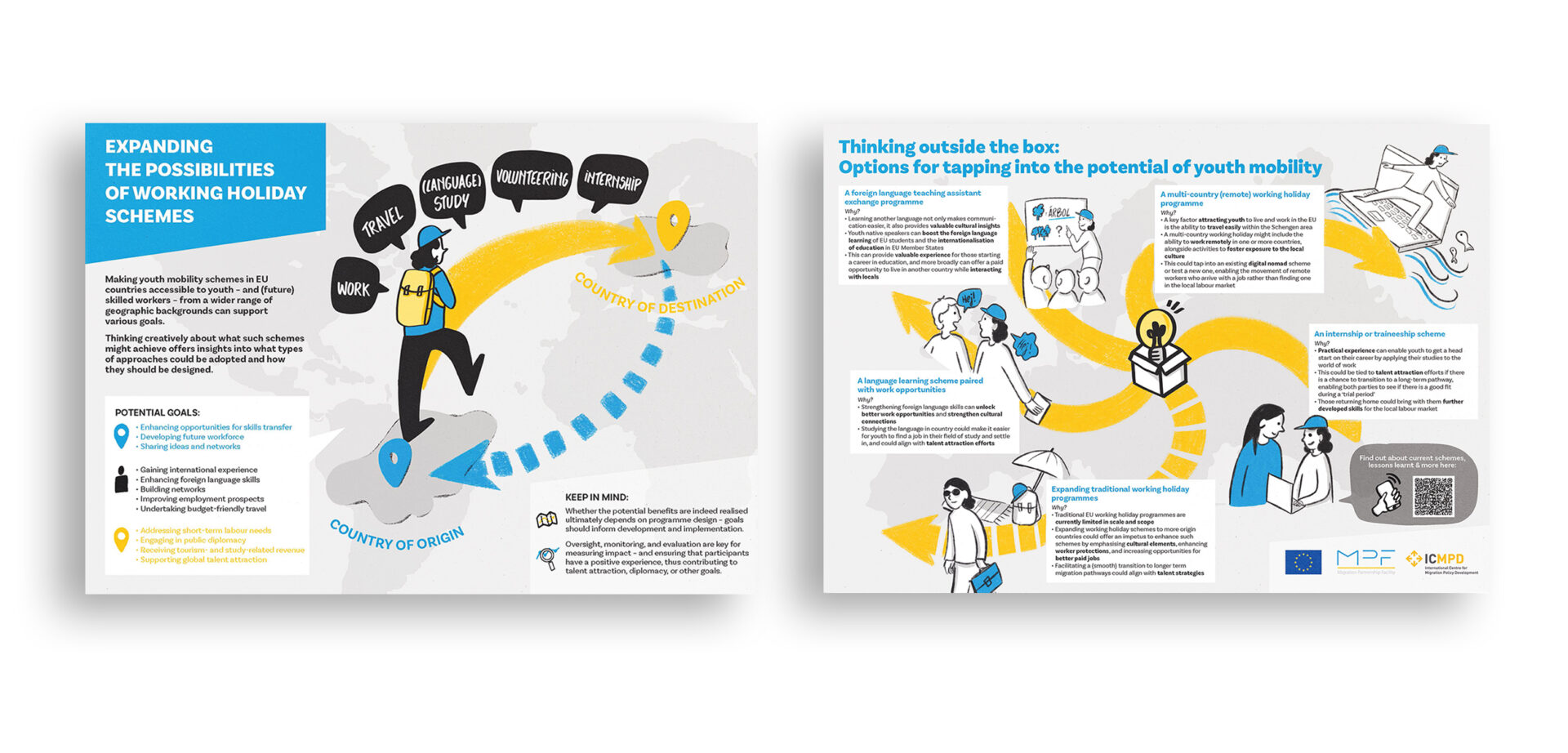
Absolutely. Visual storytelling is our thing. We create custom illustrations that match your tone, content, and brand — whether it’s a single visual highlight or a full set to bring your message to life.
Print-ready PDFs, screen-friendly digital versions, interactive documents, slide decks — whatever your audience needs. We’ll help you choose the right format.
We don’t just apply your brand style to a template. We co-create the navigation structure, narrative, and visual logic of your content. That’s what makes it clear, usable, and engaging.
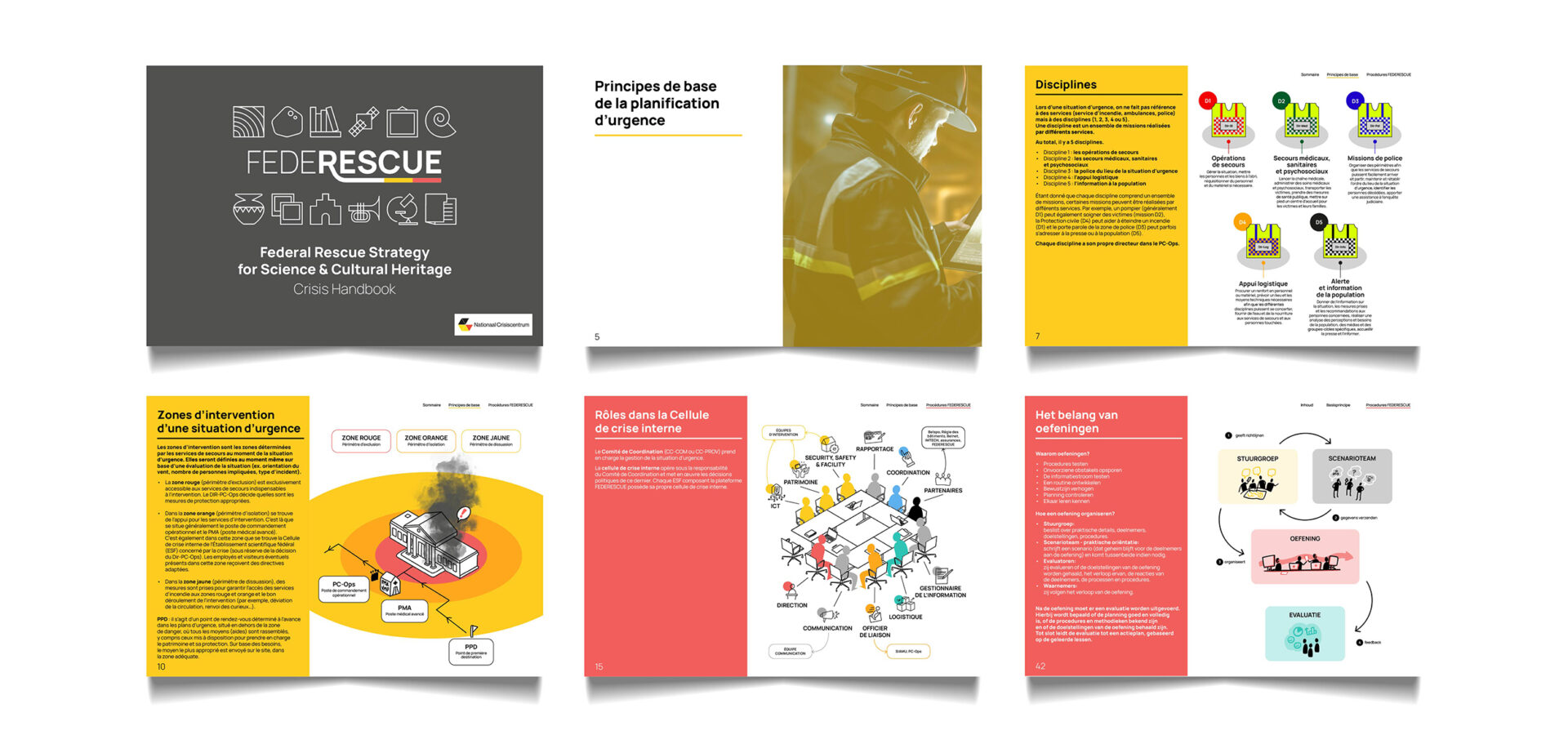
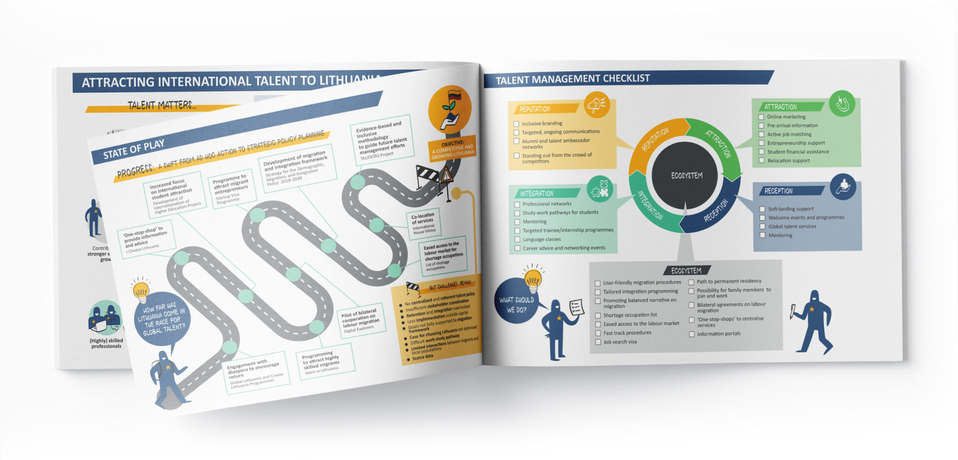
Absolutely. We’re visual thinkers — translating complexity into diagrams, illustrations, and flows is what we do best.
You do. Once the project is complete and fully paid, all rights to the final visuals and layout are yours. You’re free to publish, share, print, or adapt the work as you need. If you’d like editable source files or plan to reuse elements in other formats, we’re happy to discuss that too.